Team
My role was lead UX designer, consultant and researcher. I chose this project as an example of a quicker day-to-day task still utilizing some UX process to execute with UI, development, marketing team members and product.
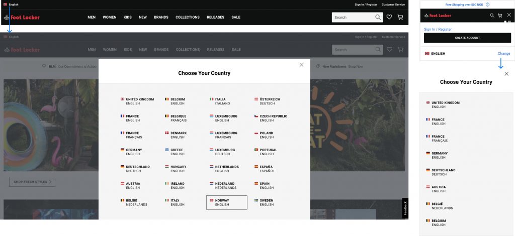
PROCESS
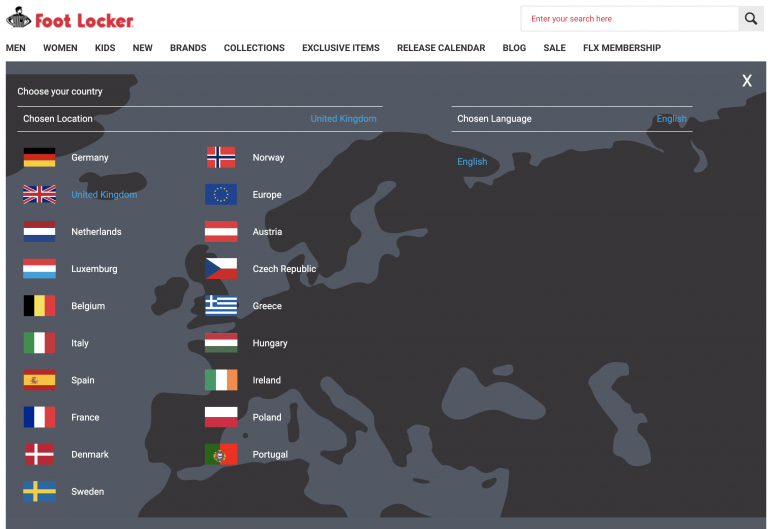
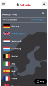
The process of this redesign was a quicker task taking less than a month to understand requirements, research, design, and gain approval before handoff!
- Product kickoff to understand the goals, and define initial usability issues with the current state.
- Light UX research through reading industry articles and looking at other examples in Europe.
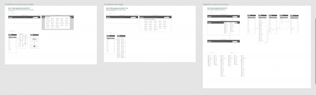
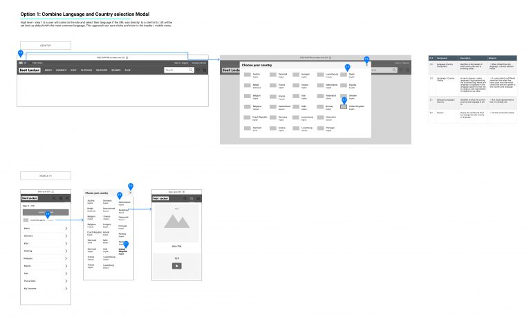
- Wireframe and present concepts to the team stating pros and cons to each.
- Finalize and annotate wireframe based off of the team feedback.
- Handoff to product and development.